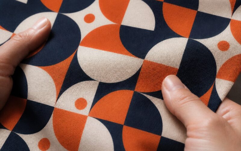













Most textile printing mistakes happen before anything is printed: artwork built at screen resolution, colour judged on a backlit monitor, a print method that doesn’t match the fibre, or a design that ignores the seams and the base fabric it will live on. The seven below are the most common, and every one is avoidable with a check that takes minutes. Fix them at the artwork stage and the print looks after itself.
The short answer: design at finished size, judge colour on fabric rather than on screen, match the method to the fibre, choose the base before you finalise the artwork, keep focal elements off the seams, test your repeat, and print one piece before you print a thousand.
1. Designing at screen resolution
A file has no resolution of its own, only pixels; resolution appears the moment you give it a print size. A 3,000-pixel-wide image looks crisp at 30 cm and turns soft stretched across a 150 cm fabric panel. The mistake is designing for how the artwork looks on screen and scaling it up at the end — upscaling adds pixels, not detail.
Avoid it: set the canvas to real-world dimensions from the start and aim for 200–300 DPI at finished size, or work in vector, which scales without loss. Send the original file, not a screenshot or a compressed export; Fabrixa creates the print files from your PDF, TIFF, JPG or PNG. The full rule is in our post on DPI, colour and file formats.
2. Trusting the monitor for colour
Screens emit backlit RGB light; fabric reflects it. The same file also renders differently per base — matte on Percale, richer on Sateen, textured on Half Panama. And reactive printing lays down no white ink, so the lightest tone in any design is the cotton itself. None of that is visible on a monitor.
Avoid it: design in a standard colour space, don’t chase the fabric on your screen, and judge critical colours on a printed piece in daylight. No CMYK conversion is needed — send the artwork in the colour space you designed in.
3. Matching the wrong print method to the fibre
The method follows the fibre, not the other way round. Reactive dye forms a covalent bond with cellulose, so it works on cotton and linen and becomes part of the fibre. Sublimation works only on polyester. Pigment print sits on the surface in a binder and cracks and fades at flex points over repeated washing.
Avoid it: decide the fibre first. Cotton or linen means reactive; polyester means sublimation, which Fabrixa runs in the Netherlands. For products that are washed often or stretched in wear, that is the case for reactive over pigment: colour typically holds for 600+ wash cycles.
4. Finalising the artwork before choosing the base
Same chemistry, different cloth. Fine lines and small type hold on smooth constructions such as Percale, Sateen and Jersey; they soften on textured bases such as Rib 2X1, Half Panama and the cotton-linen blend. If the artwork is signed off before the base is chosen, the base gets blamed for a decision made in the wrong order.
Avoid it: pick the base for the product first — Jersey for tees and dresses, French Terry for hoodies, Percale or Sateen for bedding, Half Panama for cushions and curtains — then tune the artwork to it: heavier linework for textured bases, bolder marks where texture is part of the look. Our base-by-base guide covers all seven cotton bases.
5. Designing to the mockup, not the panel
All-over print means the whole fabric panel is printed edge to edge before cutting and sewing. A hero motif placed exactly on a side seam or shoulder line is at the mercy of cut-and-sew tolerance, and a design that stops at the expected garment outline can leave a blank sliver after cutting.
Avoid it: design at panel level, extend the design past every cut line, keep focal elements confidently inside panels and let repeating texture do the work near seams. The all-over print artwork checklist runs through all eight checks.
6. Repeats that aren’t seamless
A tile that almost wraps looks fine as a thumbnail and becomes a visible grid across two metres of fabric: tramlines where the edges meet, motifs that clip, and a rhythm the eye locks onto immediately.
Avoid it: offset the tile horizontally and vertically and inspect the joins at 100% before you export, and size the tile for fabric, not for the screen. The step-by-step method is in how to design seamless repeat patterns.
7. Scaling before sampling
The most expensive mistake is the one that reaches a full run. Every point above is easy to catch on a single finished piece and impossible to undo across a collection.
Avoid it: with MOQ 1, the normal first step is to order one of the actual product — the tee, the duvet cover, the metre of fabric — on the base you have chosen. Check sharpness and colour in daylight, adjust if a base surprises you, then scale the same file to any volume. The sample is the product, not a stand-in for it.
FAQ
What is the most common textile printing mistake?
Designing at screen resolution and judging colour on screen. Both are fixed the same way: build the file at finished size and check a printed piece in daylight before the run.
Why does my print look softer than my design?
Almost always resolution: a file that holds around 250 DPI at 30 cm holds roughly 50 DPI at 150 cm. Rebuild at scale or switch to vector; upscaling does not add detail.
Can a reactive print crack or fade?
Not the way a pigment print does. Reactive colour is bonded inside the fibre rather than sitting on the surface, so there is no layer to crack at flex points, and it typically holds for 600+ wash cycles.
Catch textile printing mistakes before the fabric does
Seven checks, none longer than a coffee: finished-size resolution, colour judged on cloth, method matched to fibre, base chosen first, panel-level layout, a tested repeat, and one piece before the run. Read the reactive print guide for the full picture from file to fibre, or talk to our team about a specific design.