











Textile printing colour management on cotton starts with one physical fact: your screen makes colour out of light, and printed cotton makes colour out of dye. RGB is additive — red, green and blue light added together to produce white. Reactive dye is subtractive — dye bonded inside the cotton fibre, absorbing part of the spectrum and reflecting the rest. Some colours only exist as emitted light, so no dye on cloth can reproduce them, and most of colour management is the discipline of knowing which ones before you commit to a run.
That isn’t a quirk of reactive printing — it applies to every process on every substrate. What changes with reactive dye is where the colour ends up: inside the cotton fibre, not as a layer on top of it.
Additive light versus subtractive dye
A monitor is a grid of tiny emitters. Turn them all up and you get white; turn them off and you get black. Because it generates its own light, a screen can reach intensities no reflective surface can — which is why an electric cyan or a fluorescent green looks glorious in a design file and flat on cloth.
Cotton works the other way round. Ambient light hits the fabric, the dye absorbs part of the spectrum, and what bounces back is the colour you see. The brightest possible result is capped by how much light the base reflects — an ecru cotton has less to give than a bright optical white — and the deepest by how much dye the fibre will take up.
RGB, CMYK and the reactive gamut
A gamut is the range of colours a system can actually produce. Three matter when you prepare artwork for fabric.
| RGB (screen) | CMYK (paper print) | Reactive dye on cotton | |
|---|---|---|---|
| What makes the colour | Emitted light | Process inks on paper | Dye bonded to the cellulose in the fibre |
| Model | Additive | Subtractive | Subtractive |
| Strongest at | Saturated brights, neons, glowing blues and greens | Clean neutrals and mid-tones | Deep saturation and a long tonal range within a hue |
| Struggles with | Nothing — it exceeds what any print can hold | Vivid saturation, fluorescents | Fluorescents, metallics, anything that needs emitted light |
| Substrate effect | None | Some — paper whiteness and coating | Strong — weave, weight and base whiteness all show through |
| Where the colour sits | Not applicable | On the paper surface | Inside the fibre, with no surface layer |
The practical reading: keep designing in RGB, because that is what your tools and your customers’ screens use — but design knowing the extremes of that gamut have nowhere to land on cotton. Send the artwork you have as PDF, TIFF, JPG or PNG and we create the correct print files for the product and base you have chosen. Our post on DPI, colour and file formats covers the file-side detail.
The base is part of the colour
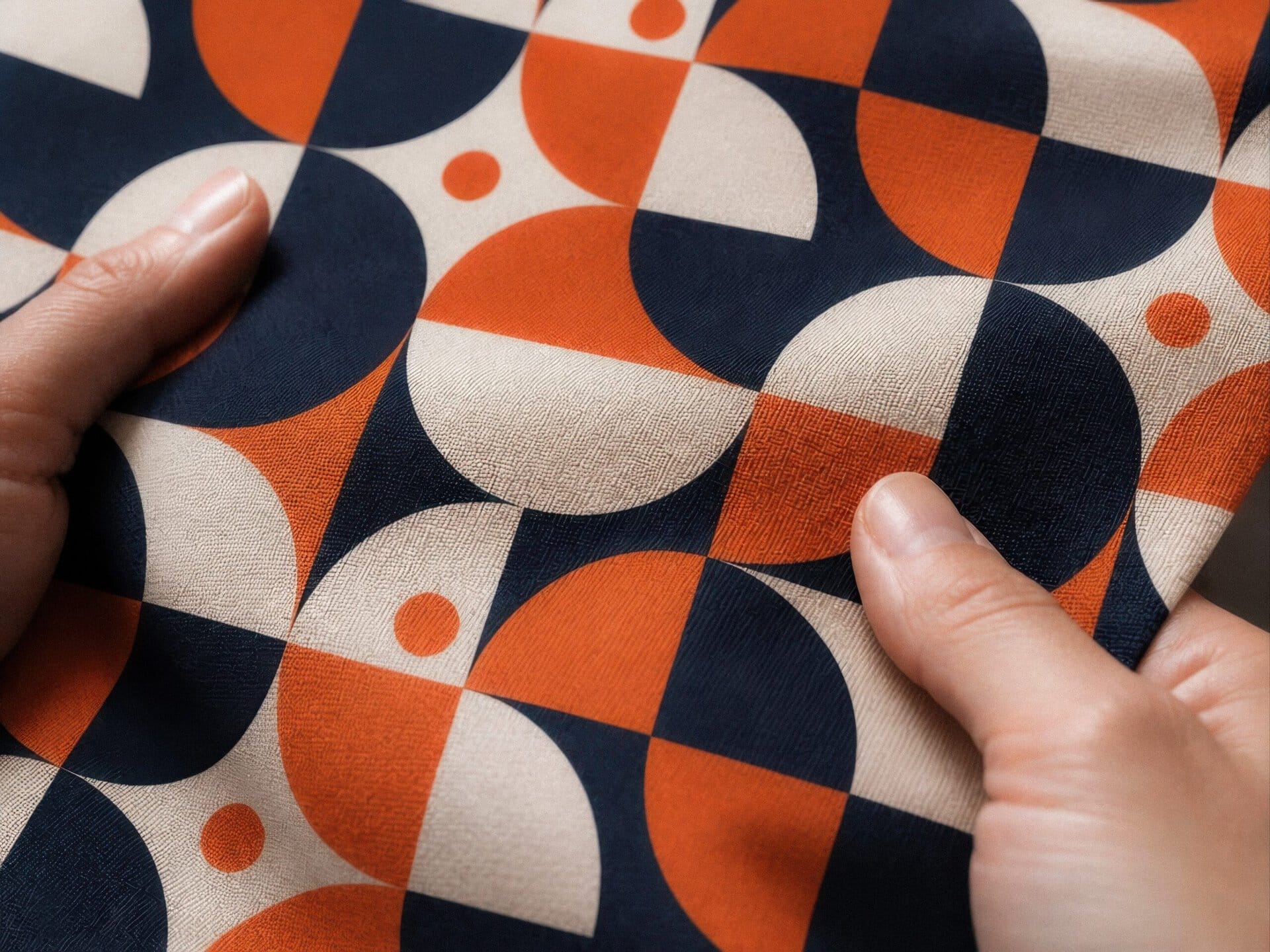
Because reactive dye becomes part of the fibre, the fabric’s own structure stays visible through the colour instead of being hidden beneath it. The same file on three cotton bases gives three different results:
- Percale — a plain, matte weave. Edges read crisply and fine detail holds; colour looks clean rather than glossy.
- Sateen — a smoother face that reflects more light, so the same colour reads more saturated and deeper.
- Half Panama — a heavier, textured weave. The texture breaks up the surface, softening fine detail and giving colour a more tactile character.
Linen behaves differently again: as a cellulose fibre it takes reactive dye the same way, but its irregular structure scatters light, so colour reads softer. Sublimation on polyester is a separate chemistry with its own gamut, and isn’t comparable base for base.
Textile printing colour management in practice
Nothing replaces seeing dye on the actual base. But a few habits narrow the gap between screen and cloth.
- Design for the middle, not the edge. A colour already at the limit of what a screen can display has no headroom. Pull the saturation back a step and the printed result lands closer to your intent.
- Judge relationships, not absolute values. Whether two colours read as distinct survives the move to cloth. An exact hex value does not.
- Watch the near-blacks and near-whites. Very dark tones can close up and lose detail; very light tones can disappear into the base.
- Check contrast at arm’s length. An all-mid-tone pattern can look muddy on fabric even when it reads well at 100% on a bright screen.
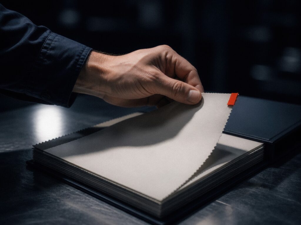
- Sample before you scale. A Sample Pack shows how reactive dye resolves on each base, and its cost is credited against your first order. With MOQ 1 you can also print a single finished piece to check a decision.
Why the colour doesn’t drift later
One thing you don’t have to manage on cotton is the print degrading. The reactive dye forms a covalent bond with the cellulose in the fibre and is fixed permanently under heat and steam, so the colour becomes part of the cotton rather than a coating resting on it. There is no binder to break down and no surface film to crack, which is why colour typically holds 600 wash cycles and more — until the cotton itself wears out. How reactive printing works goes through the chemistry step by step.
Frequently asked questions
Should I supply artwork in RGB or CMYK?
Either is fine. Send the artwork as you have it, in PDF, TIFF, JPG or PNG, and we create the correct print files. Resolution at finished size matters far more — around 200–300 DPI on the printed piece.
Why does my print look less bright than my screen?
A screen emits light and cloth reflects it, so a monitor can display saturation no dye on any fabric can reach. Colours sitting near the edge of the RGB gamut are the ones most likely to surprise you.
Will one file print identically on two different cotton bases?
No, and it’s worth planning for. Weave, weight and surface change how much light the fabric reflects, so a sateen reads more saturated than a matte percale from exactly the same file.
Can reactive printing match a specific brand colour?
Reactive dye covers a wide, deep range on cotton, but fluorescents and metallics sit outside what dye on a natural fibre can do. If a brand colour is critical, print it on the base you intend to use and judge it in daylight first.
The reactive print guide walks through the whole process, from artwork to finished piece made across Portugal, Spain and the Netherlands. If you have a colour that has to be right, order a Sample Pack — or talk to our team about which base will get you closest.